


Article: How to Choose the Right Size Artwork for Your Wall
Choosing artwork is often the easy part. Choosing the right size is where people hesitate.
A piece can be beautiful on its own and still feel too small, too heavy, or out of proportion once it is on the wall. The good news is that scale is usually less mysterious than it seems. With a few simple guidelines, it becomes much easier to narrow in on what will actually feel right in your space.
Start with the wall, then look at the room as a whole
One of the most common mistakes is falling in love with a piece before considering the wall it needs to live on.
Before thinking about style, palette, or subject matter, start by looking at the amount of open wall space you are trying to fill. A painting should feel connected to its surroundings, not like it is floating in too much empty space or pressed too tightly into a small area.
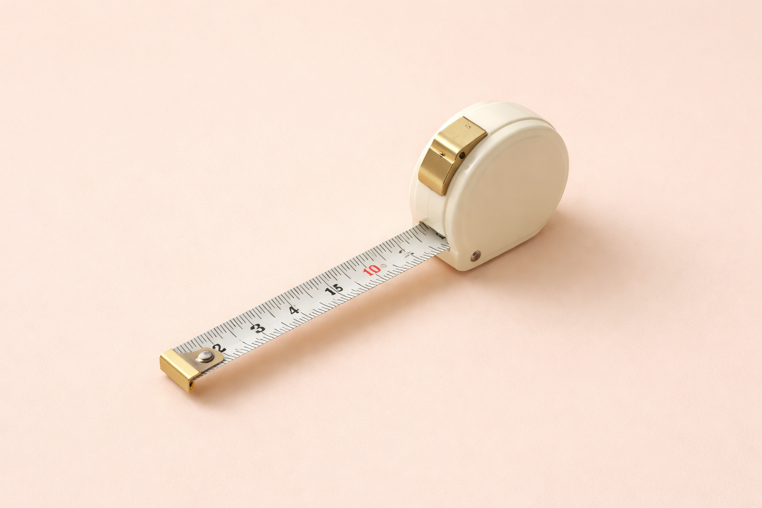
It helps to measure the width and height of the wall area you want the artwork to occupy, especially if furniture, moldings, lamps, windows, or architectural details affect the available space. This gives you a much more realistic sense of what size range will feel balanced.
Think in proportion to the furniture below it
Artwork rarely exists in isolation. Most of the time, it is in conversation with something else: a sofa, a bed, a console, a fireplace, a dining table, or an entry bench.
As a general rule, artwork tends to feel best when it relates to the width of the furniture below it rather than the full width of the wall. A piece that is too narrow can feel disconnected, while one that is too wide may start to overwhelm the room.
Over a sofa, bed, or console, the artwork or grouping often feels best when it spans roughly two-thirds to three-quarters of the furniture’s width. This is not a rigid formula, but it is a reliable place to begin.

Over a bed, sofa, or console
The furniture below the artwork changes how scale is read.
Over a sofa, art usually needs more presence than people expect. Because sofas tend to be wide and visually heavy, a piece that looked substantial on its own can suddenly feel small once it is placed above one. In many living rooms, a single larger work or a well-balanced grouping tends to feel stronger than something underscaled.
Over a bed, scale matters, but so does calm. The piece should feel substantial enough to anchor the wall while still feeling settled in the room. A horizontal piece often works well above a bed, especially when it echoes the width of the headboard.
Over a console, the composition can be a little more flexible, but the relationship still matters. A piece that is too small can feel incidental rather than intentional, especially in an entryway or dining room where you want the arrangement to feel resolved.
In each case, the artwork should feel connected to the furniture below it, not stranded in the middle of a much larger wall.
Bigger is often better than people think
Many collectors initially lean too small.
A painting that feels substantial in a gallery or on a product page can often look much smaller once it is placed in a real room, especially above larger furniture or on walls with higher ceilings. What feels safe on paper can end up feeling under-scaled in person.
That does not mean every wall needs a large statement piece, but it does mean it is worth considering whether the artwork has enough presence for the space. In many interiors, one properly scaled piece will feel stronger and more finished than something smaller that leaves too much wall around it.
Pay attention to ceiling height and room scale
The size of the room matters just as much as the size of the wall.
A painting that works beautifully in a smaller sitting room may feel modest in a large open-concept space. High ceilings, wide walls, and expansive rooms can usually carry more scale, while more intimate rooms may benefit from something quieter and more contained.
This is especially important in entryways, stair halls, dining rooms, and rooms with tall vertical walls, where a piece needs enough visual weight to hold its own within the architecture.
Statement piece vs. grouping
There are times when a single painting is the strongest answer, and times when a grouping makes more sense.
A single large work tends to feel calmer, more confident, and more architectural. It creates a clear focal point and often brings a room together quickly.
A grouping can work beautifully when there is a reason for it, whether that is telling a broader story, layering smaller works, or creating flexibility with size and arrangement. Groupings still work best when they are treated as one visual unit. The overall footprint matters just as much as the dimensions of the individual pieces.
If your goal is to fill a larger wall with ease and impact, one well-scaled piece is often the more elegant solution.
Height matters too
Even the right size can feel wrong if it is hung too high.
Artwork above furniture usually feels best when it sits with enough breathing room to feel distinct, but not so high that it becomes disconnected. If there is too much empty space between the bottom of the frame and the furniture below, the relationship weakens and the arrangement starts to feel less intentional.
The exact spacing will vary, but this is one more reason why stepping back and looking at the room as a whole is often more helpful than relying too heavily on numbers alone.
Why breathing room matters
Good placement is not only about the artwork itself, but also the space around it.
Leaving enough room between the piece and nearby furniture, trim, or architectural details helps it feel settled rather than crowded. Even the right size can feel off if it is squeezed too tightly into its surroundings.
That surrounding space is part of what makes the artwork feel intentional on the wall.
When in doubt, mock it up
Scale is much easier to judge in context than in theory.
Painter’s tape, paper templates, room photos, and virtual mockups can all help you see whether a piece will feel properly balanced before making a final decision. What feels uncertain on a product page often becomes much clearer once you see the artwork in relation to the room, the furniture, and the surrounding space.
That extra step can save a great deal of second-guessing.
The best size is not always the biggest, and it is not always the piece you loved first. It is the one that feels balanced in the room, in proportion to the furniture, and natural within the architecture of the space. Once that relationship is right, the room tends to come together much more easily.